


Adresse
1 rue de Saint-Petersbourg75008 Paris
Mail
contact@bam.techTéléphone
+33 (0)1 53 24 00 83
Are you ready to add some colorful flair to your Jetpack Compose project? In the following lines, you will be walked through implementing a circular progress indicator with a gradient.
With each step, we will discover a bit of Jetpack Compose implementation, ++code>Canvas++/code> API and ++code>SweepGradient++/code>.
Let's take a look at the design that our designer has provided for implementation:

it provides the following challenges:
Having to implement such component from scratch can be intimidating. If you lack experience with ++code>Canvas++/code> and graphics, your implementation could lead to:
The idea here is to stand on the shoulders of giants and derive a Jetpack Compose Component: ++code>CircularProgressBar++/code>.
Let's try to implement it!
This is the result using the standard ++code>CircularProgressIndicator++/code> :
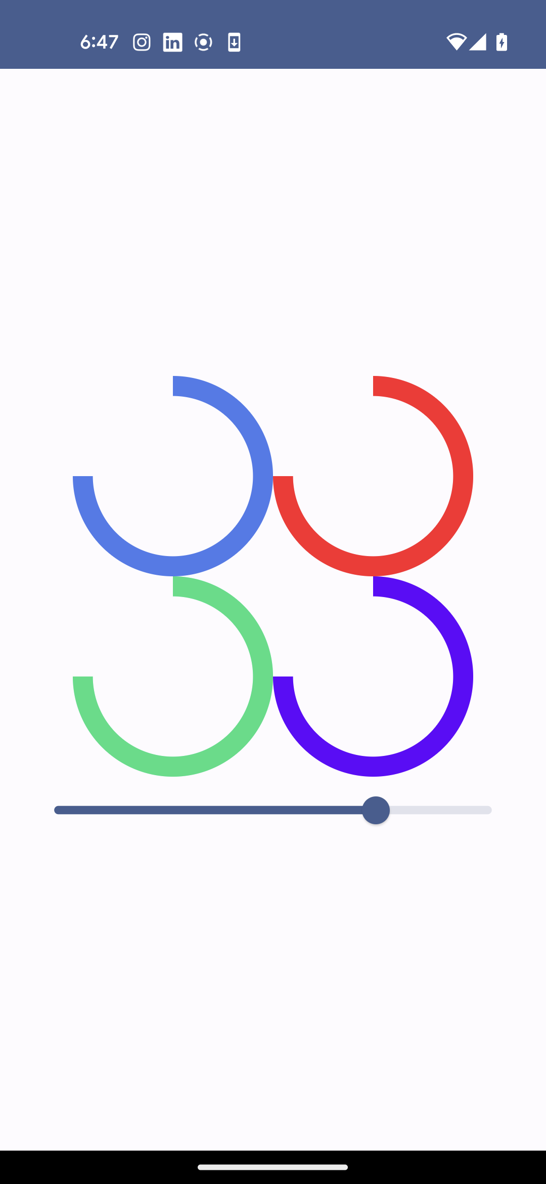
limitations:
Let's take a closer look at the source code of ++code>CircularProgressIndicator++/code>. You can easily navigate to it, or browse the Android X source base on GitHub.
For information, the version of the file used is right here. (++code>1.0.0-alpha11++/code>)
++code>CircularProgressIndicator++/code> has slightly evolved since then, but the modification proposed should be applicable without issue.
What's really striking is how surprisingly easy the code is to follow! This is a massive improvement over the View system (for instance, the 8k+ lines of TextView).
It seems to have been written by humans who have actual problems. Like any codebase, it contains clarifying comments and even TODOs!
Now, let's duplicate the ++code>CircularProgressIndicator()++/code> composable function and its sub-functions. Only three functions and a few modifications are needed to isolate the component and make it compile. Once again, this is good news; great job on decoupling, Compose developers!
Adding the track can be done by using ++code>drawDeterminateCircularIndicator()++/code> as it’s done for the Indicator.
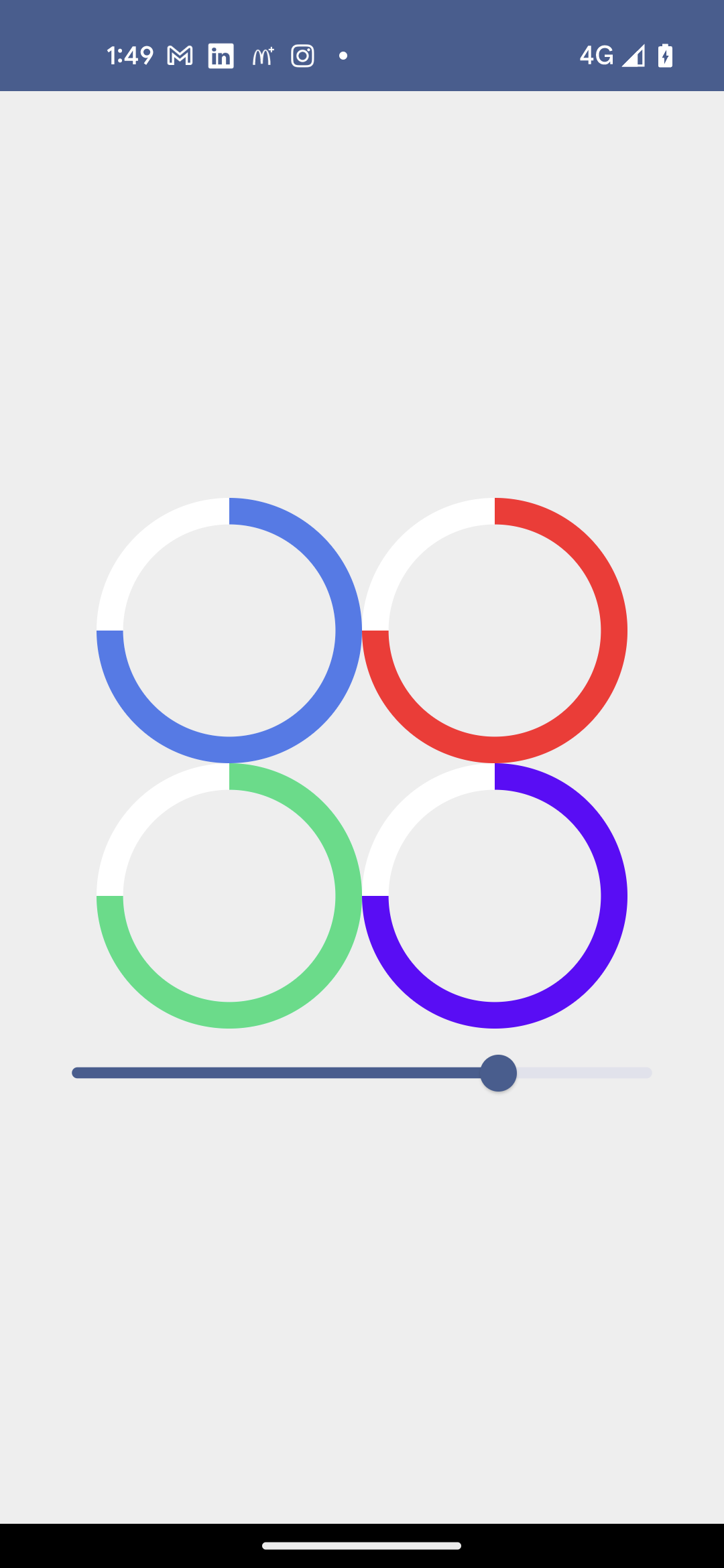
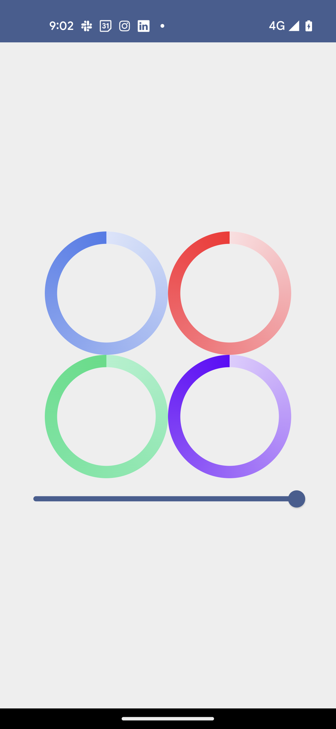
Let’s now discover the Gradient API. We don’t try to match our design yet, just draw the circles with some gradient.
Just create a new ++code>drawCircularIndicator()++/code> taking 2 colors instead of one, and using the brush param of ++code>drawArc()++/code>.
The result is starting to look like our design!
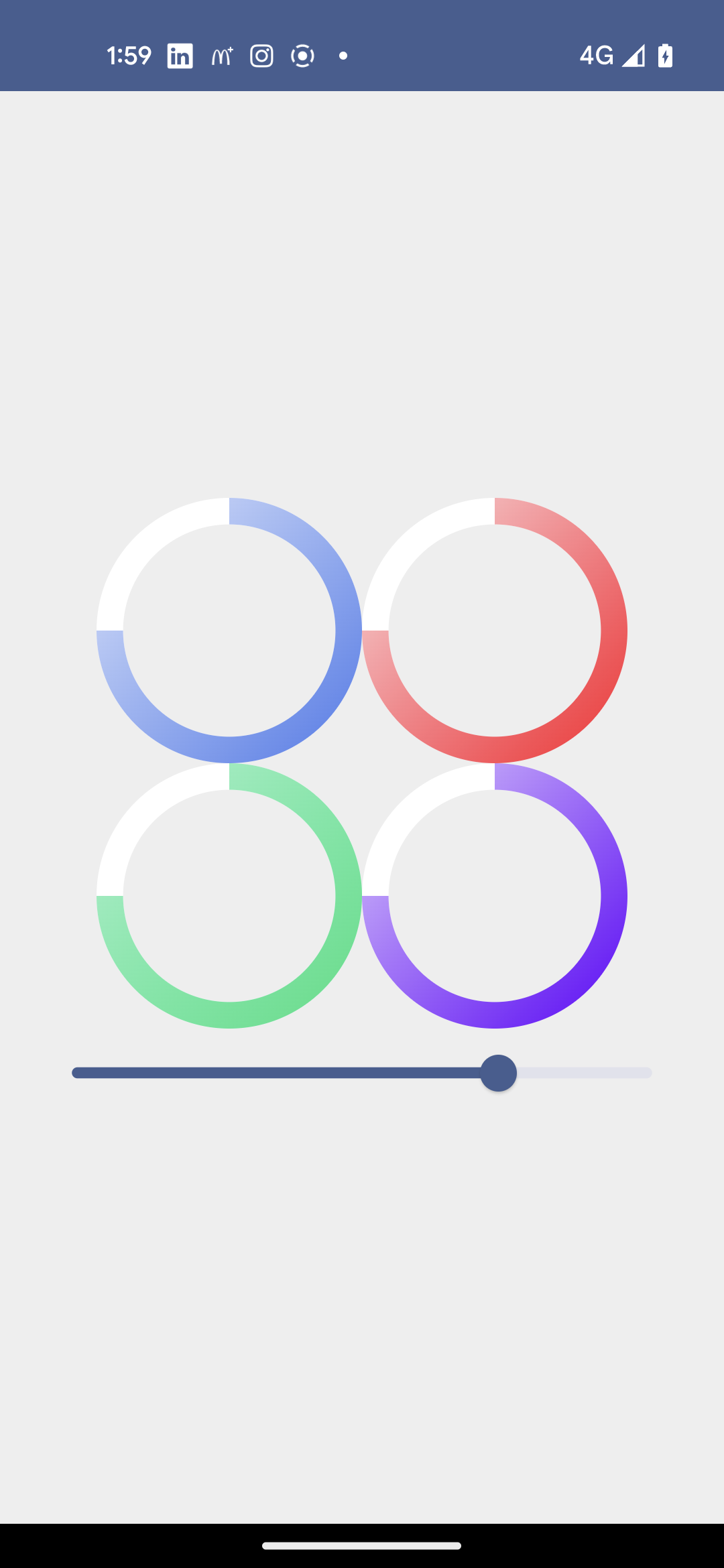
++code>Brush.sweepGradient()++/code> allows to draw what is sometime called circular gradient. This is what is used in the reference design.
So far, the out of the box result is near to what is expected, but needs minor tweaks.
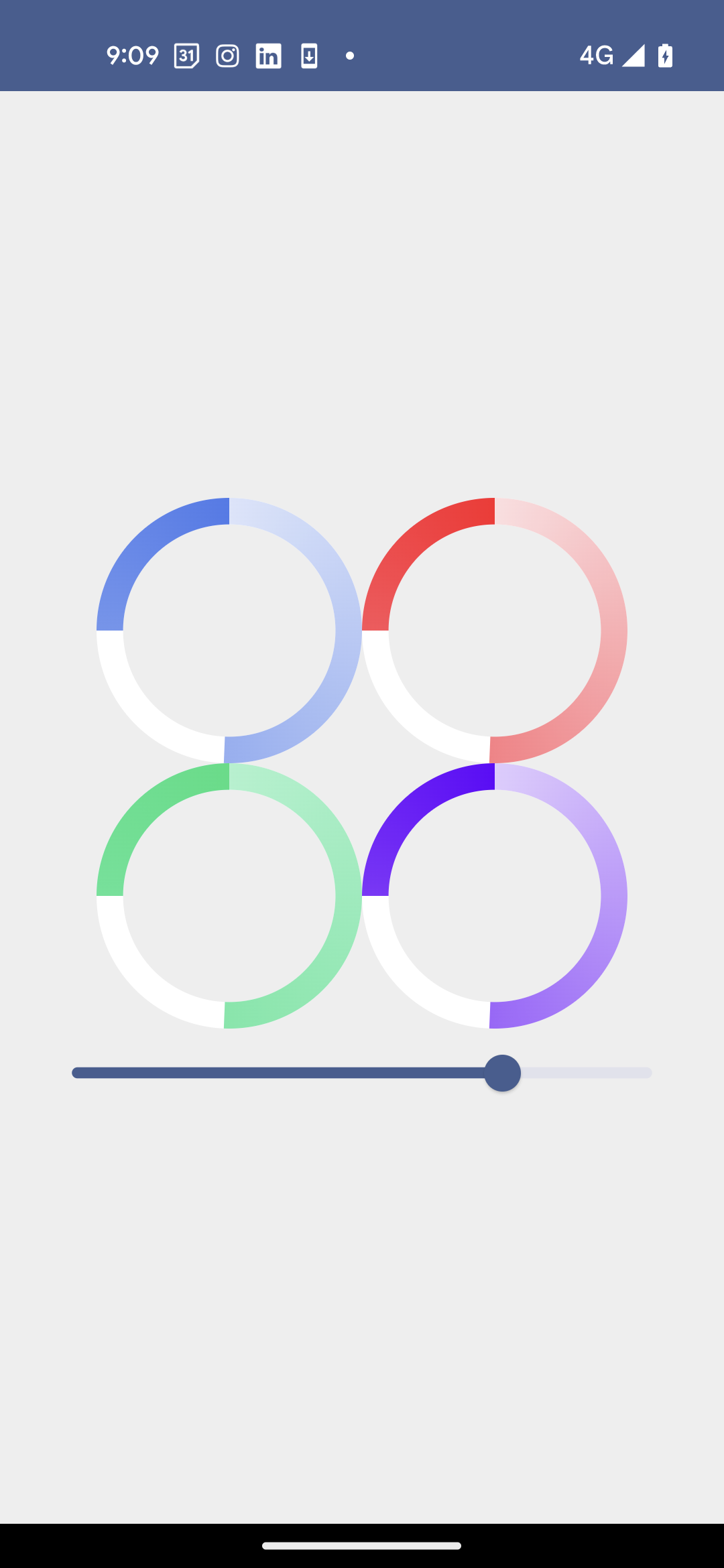
First, the gradient is supposed to be drawn from the top of the circle, not the right. Fortunately, ++code>Canvas++/code> API provides a convient api to rotate what’s drawn:
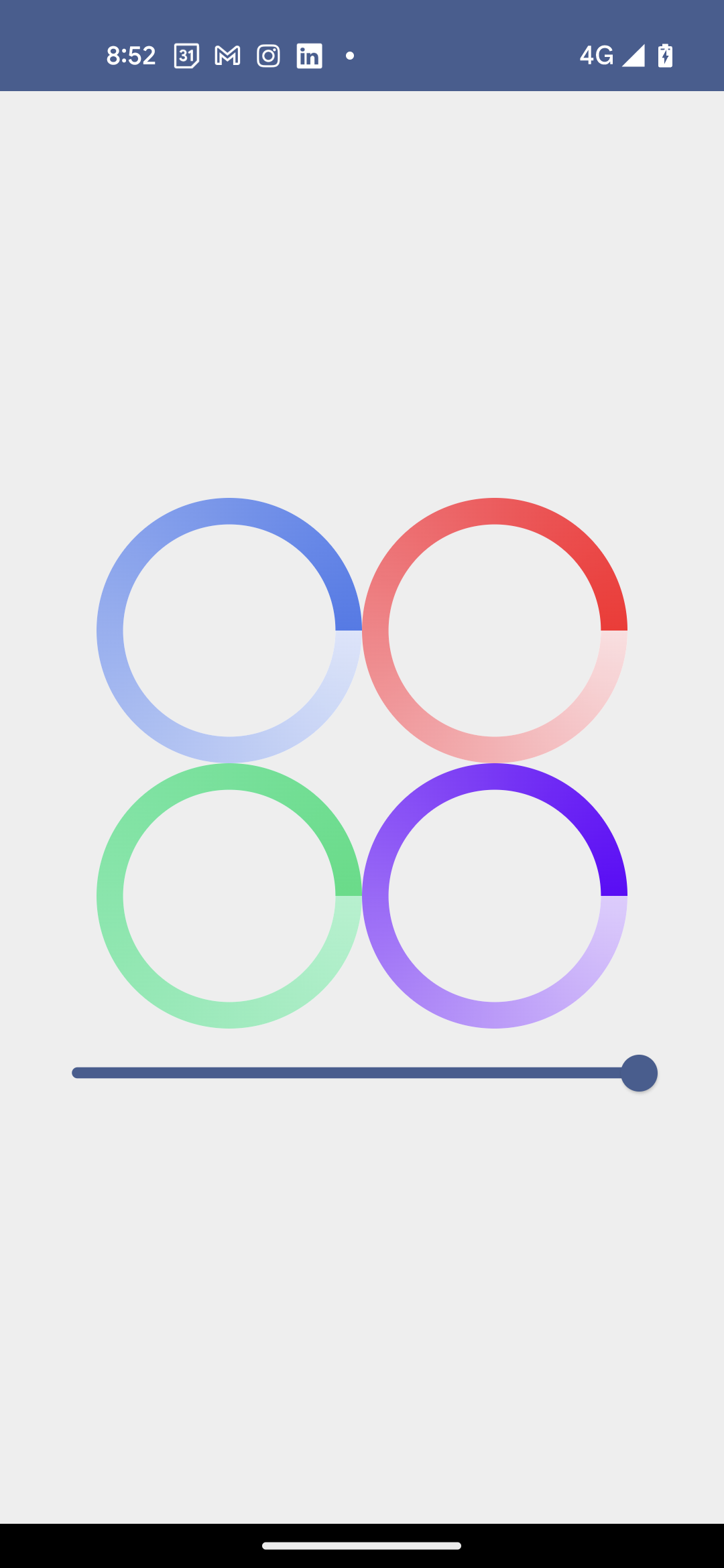
This gives us the expected result:
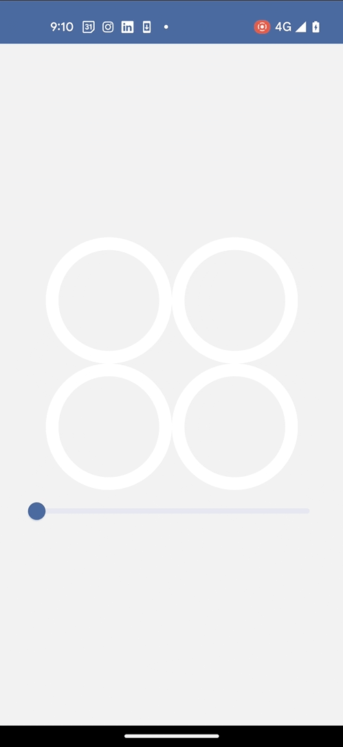
Except for a small caveat: it only works when progress is 100%. Otherwise, it’s broken:
Let’s fix this!
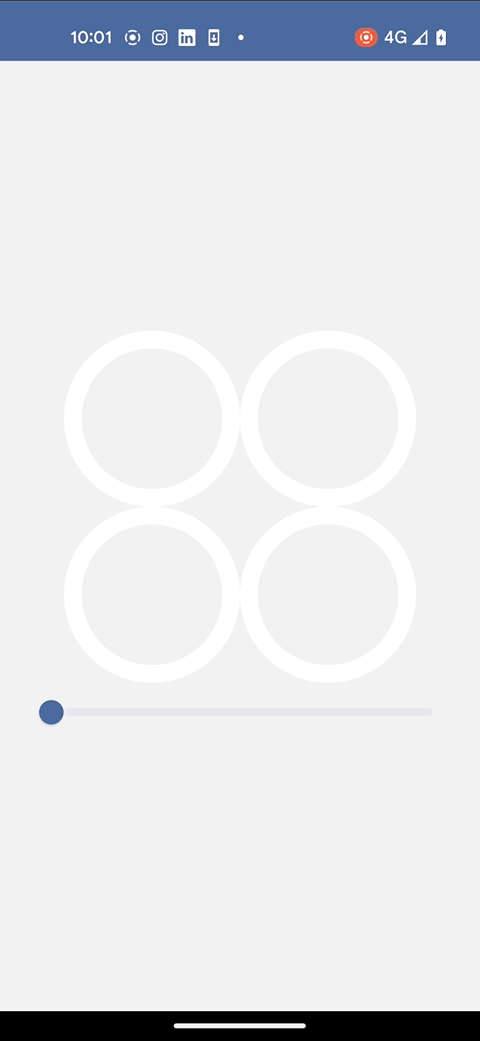
Here, we just need a one line change: add 90 degrees to the start angle:
Now, the progress is drawing as intended.
Here, we want to draw the full gradient (from start color to end color) whatever the progress is. we can replace the color list with an array of ++code>Pair<Float, Color>++/code> which gives key points to draw the gradient. We want to sync the gradient with the progress angle, so we use the ++code>sweep++/code> value to get the end point.
Note: We could have more than two key points which would allow to use more than two colors.
And here is the final result:
You can find the source code (with step by step commits 🤓) on which this article is based here : compose-gradient-progress-indicator.


Le BAM Innovation Lab, pour rester à la pointe des dernières innovations tech et produit !


