


Adresse
1 rue de Saint-Petersbourg75008 Paris
Mail
contact@bam.techTéléphone
+33 (0)1 53 24 00 83
Creating and maintaining a robust library of components can quickly become a tiring task. On my current project, using Storybook became a great way to make sure our components were reusable and to detect bugs faster. I will describe in this article how we integrated Storybook in our workflow. First, how to install Storybook, then how to efficiently use Knobs and Storyshots add-ons, and finally sharing some tips with you!
So first of all, what is Storybook? Storybook is an isolated environment where you can design and visualize the different states of your components.
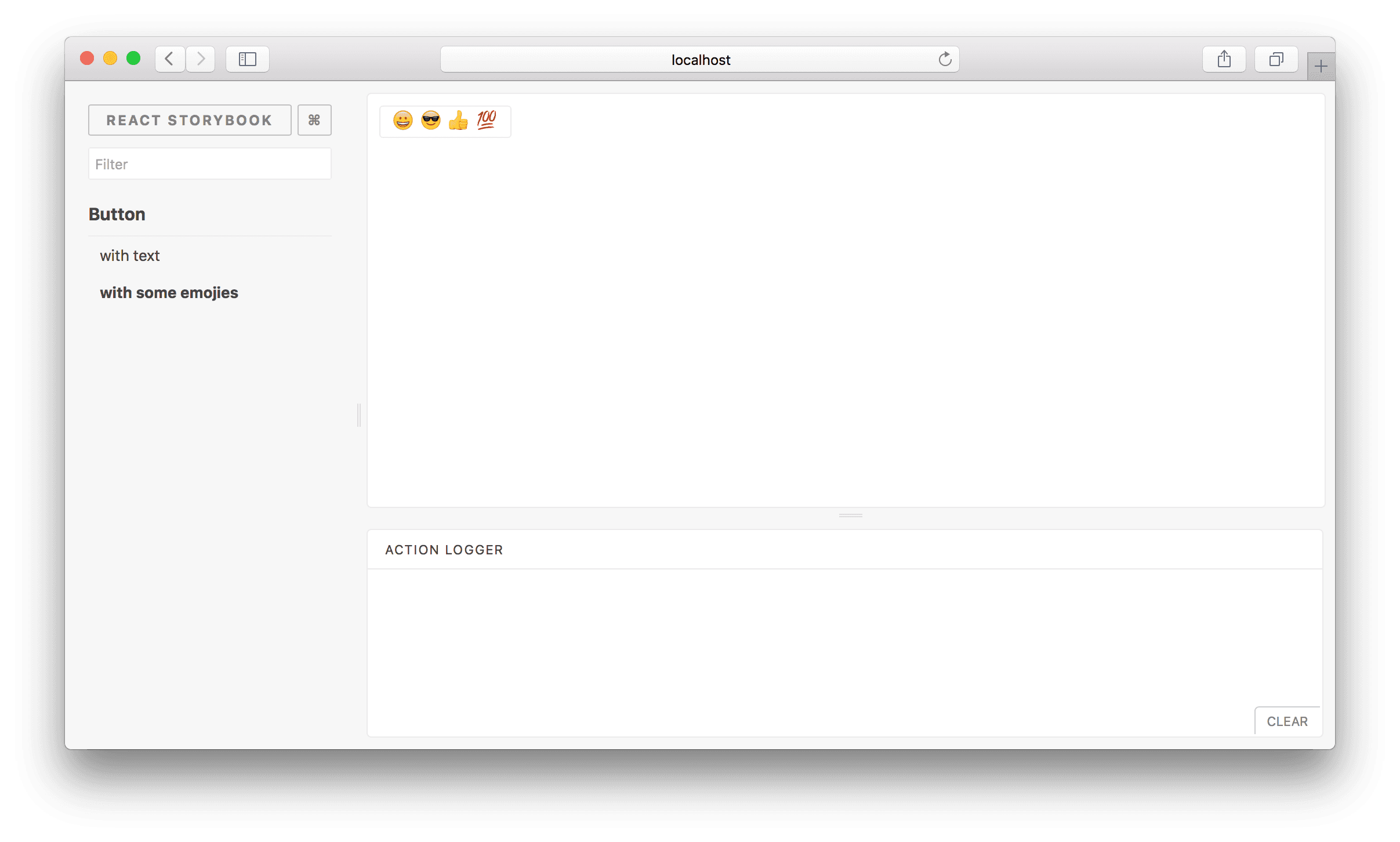
I will use the example of a basic React project, that includes a simple Button component:
++pre>++code>import React from 'react';
import styled from 'styled-components';
const StyledButton = styled.button`
height: ${props => (props.big ? 46 : 36)}px;
outline: none;
padding: 0 20px;
border-radius: 4px;
&.primary {
background-color: #1585d8;
& span {
color: white;
}
}
&.secondary {
background-color: #eff3f6;
& span {
color: grey;
}
}
`;
const Button = props => (
<StyledButton
big={props.big}
className={props.theme}
onClick={props.onClick}
style={props.style}>
{props.label &&<span>{props.label}</span>}
</StyledButton>
);
Button.defaultProps = {
big: false,
label: undefined,
onClick: () => {},
style: {},
theme: 'primary',
};
export default Button;++/pre>
Those 2 lines of code will install Storybook in your React project:
++pre>cd my-project-directory
npx -p @storybook/cli sb init++/pre>
For further instructions, I invite you to read Storybook documentation.
With the command ++code>npm run storybook++/code>, you will be able to access Storybook interface. Here is an example of a basic story for our component:
++pre>++code>import React from 'react';
import { storiesOf } from '@storybook/react';
import Button from '../components/Button';
storiesOf('Button', module)
.add('with label', () =><Button label='Hello Button' />);++/pre>
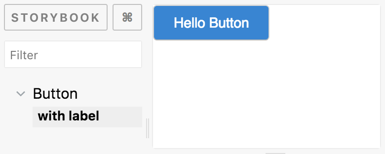
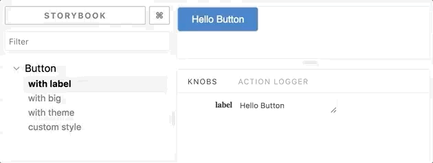
Visualization of our basic story in Storybook
Goal: Edit your component properties in real-time in Storybook
This add-on is the one that we use the most in our components stories, and since it is not preinstalled with Storybook, I will first show you how to install it:
++pre>npm install @storybook/addon-knobs --save-dev++/pre>
Then, import the add-on in the file ++code>addons.js++/code> located in ".storybook" folder:
++pre>++code>import '@storybook/addon-knobs/register'; ++/pre>
You should now see a tab called "Knobs" in your Storybook interface, and start using it in your stories like this:
++pre>++code>import React from 'react';
import { storiesOf } from '@storybook/react';
import { withKnobs, text, select, boolean, object } from '@storybook/addon-knobs';
import Button from '../components/Button';
const themes = ['primary', 'secondary'];
storiesOf('Button', module)
.addDecorator(withKnobs)
.add('with label', () =><Button label={text('label', 'Hello Button')} />)
.add('with big', () =><Button label="Big Button" big={boolean('big', true)} />)
.add('with theme', () => (
<Button label={text('label', 'Themed button')} theme={select('theme', themes)} />
))
.add('custom style', () => (
<Button
label="Custom style"
style={object('style', {
backgroundColor: 'pink',
border: '5px dotted limegreen',
})}
/>
));++/pre>
You can now easily verify that your properties have the behaviour expected. Moreover, since Storybook is connected to your component, any change you make to it will be observable in Storybook in real time.
In order to fully test your component, I recommend to create a story where you will use knobs for every property your component has:
++pre>++code>storiesOf("Button", module)
.addDecorator(withKnobs)
.add('playground', () => (
<Button
label={text('label', 'Hello World !')}
big={boolean('big', true)}
theme={select('theme', themes)}
style={object('style', {})}
/>
));++/pre>
In your Storybook, you now have a story that allows you to modify all your properties at once.
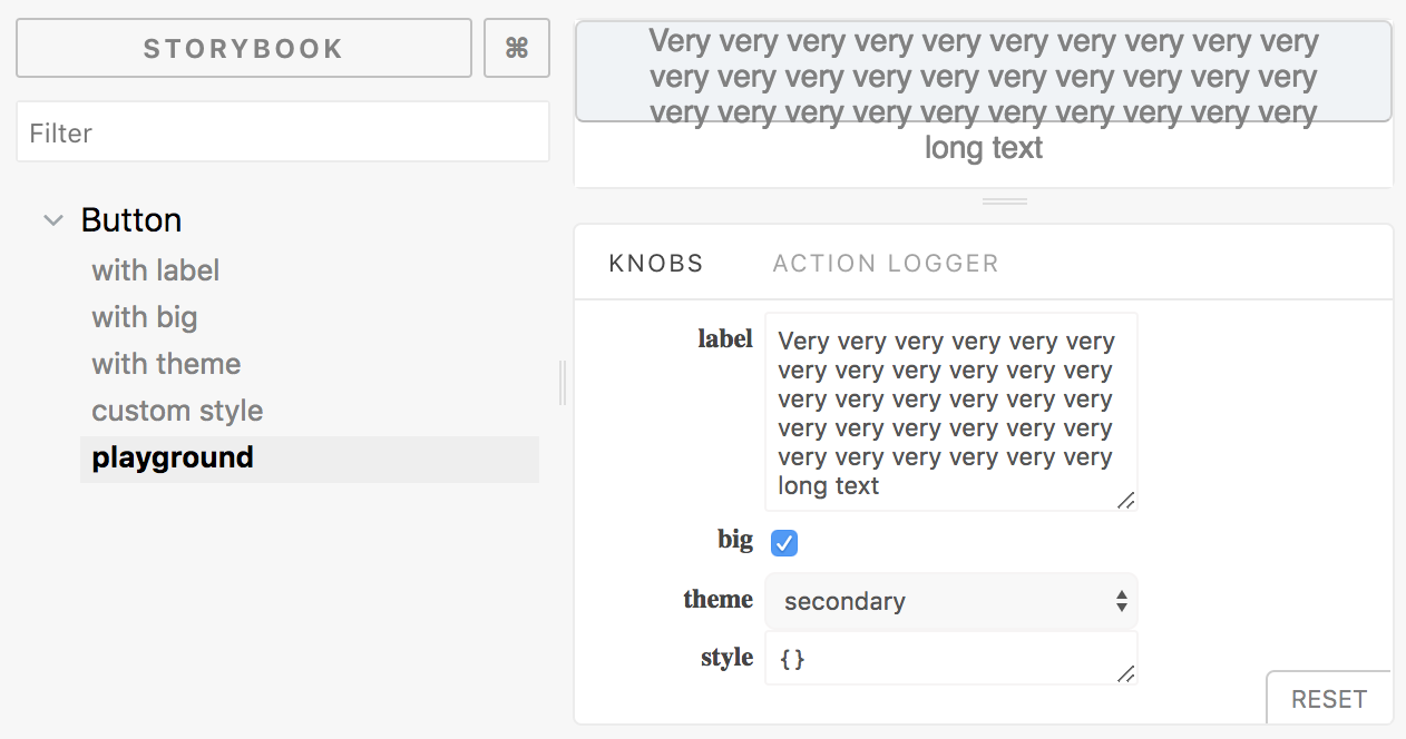
Example of label property edge case: too long text escapes from the button
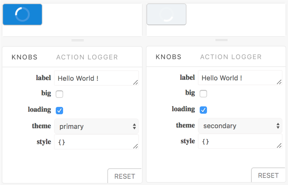
Example of property loading which does not render well with secondary theme
Goal: Add automatic Jest snapshot testing to all your stories
No excuse for forgetting to add a snapshot anymore: each time you write a story for a component, a snapshot is automatically added by this add-on. If needed, have a look to this article for an introduction on Jest snapshots.
Installation steps for a React project with Jest configured:
++pre>npm install --save-dev @storybook/addon-storyshots
npm install --save-dev react-test-renderer++/pre>
Then create a file ++code>Storyshots.test.js++/code> in your stories folder:
++pre>++code>import initStoryshots from '@storybook/addon-storyshots';
initStoryshots(); ++/pre>
You can now use the usual ++code>npm test++/code> command, and it will create Jest snapshots for your stories:
In order to have a snapshot for every edge cases, you should consider adding stories that deal with "too large" or empty values. For example, if one of your properties is an array, add a story where this property is an empty array. If one of them is a text, add a story where this property is a very long text.
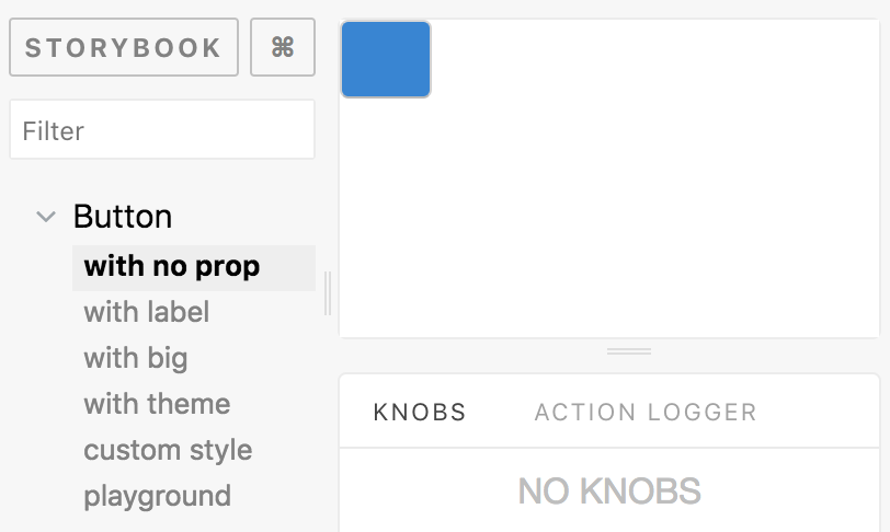
Also, add a story that renders your component without any property to check if your component properly render:
++pre>++code>storiesOf('Button', module)
.addDecorator(withKnobs)
.add('with no prop', () =><Button />)++/pre>
That way, you will be able to easily check your edge cases in Storybook, and have related snapshots generated by Storyshots add-on.
I presented you earlier a story for the "theme" property of our Button component. Now that Storyshots is installed and that you have a story "playground", a good idea will be to delete the knobs method in the story "with theme" and rather add a Button component for each value of this property in it:
++pre>++code>storiesOf('Button', module)
.addDecorator(withKnobs)
.add('with theme', () => (
<React.Fragment>
<Button label="Button with primary theme" theme="primary" />
<Button label="Button with secondary theme" theme="secondary" />
</React.Fragment>
))
.add('playground', () => (
<Button
label={text('label', 'Hello World !')}
big={boolean('big', true)}
theme={select('theme', themes)}
style={object('style', {})}
/>
));++/pre>
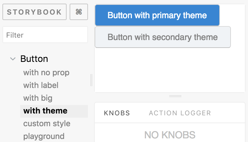
Storyshots will then automatically create snapshots for those two values. Playground story will allow you to select one or the other, whereas story "with theme" will show you the two available values for this property.
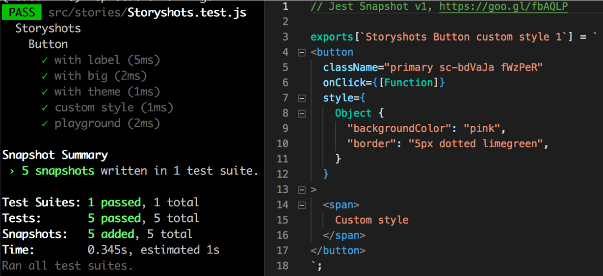
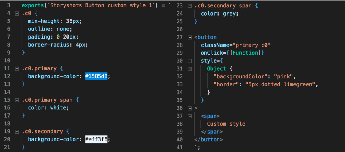
As you could see in the previous example of story snapshot, style is not clearly shown in snapshots when you use styled components. Instead of the actual style, you only see a hash in className property. In order to make your snapshots more precise, I recommend using jest-styled-components library that allows to show related CSS in snapshots:
++pre>yarn add --dev jest-styled-components++/pre>
Then import it at the beginning of your Storyshots.test.js:
++pre>++code>import jest-styled-components++/pre>
Here is how the previous snapshot now looks like:
This being said, be careful to add stories for specific edge cases (like without any props or in data loading state), as you will do by writing a specific snapshot test on your own.
I recommend using the extension ".stories.js" for all your stories to easily identify them and separate them from classic files of your project. (??do not forget to update your ++code>config.js++/code> file if needed).
This will allow you to automatically add any new stories file to your Storybook, without worrying about adding it in an index file. Modify your ++code>config.js++/code> file as below to do so:
++pre>++code>import { configure } from '@storybook/react';
const req = require.context('../stories', true, /\.stories\.js$/);
function loadStories() {
req.keys().forEach(filename => req(filename));
}
configure(loadStories, module);++/pre>
??if you are using Storybook 4.0 version, you will have to add a babel plugin to be able to use ++code>require.context++/code>. See this link for more details.
Creating a new story file is already an easy thing to do, but using a snippet will make you be even more efficient. It should now take only a few minutes! To help you create your own, here is the snippet we use in our project:
++pre>++code>"Storybook stories": {
"prefix": "reactstory",
"description": "Create a new story for storybook",
"body": [
"import React from 'react';",
"",
"import { storiesOf } from '@storybook/react';",
"import { boolean, color, object, select, text, withKnobs } from '@storybook/addon-knobs';",
"import { action } from '@storybook/addon-actions';",
"import ${TM_FILENAME/(.*)\\.stories\\..+$/$1/} from \"yourprojectalias/components/${TM_FILENAME/(.*)\\.stories\\..+$/$1/}\"",
"",
"",
"storiesOf('${TM_FILENAME/(.*)\\.stories\\..+$/$1/}', module)",
".addDecorator(withKnobs)",
"",
".add('with no props', () => (",
"<${TM_FILENAME/(.*)\\.stories\\..+$/$1/} />",
"))",
"",
".add('loading', () => (",
"<${TM_FILENAME/(.*)\\.stories\\..+$/$1/} isLoading={boolean('isLoading', true)} />",
"))",
"",
".add('playground', () => (",
"<${TM_FILENAME/(.*)\\.stories\\..+$/$1/}",
"label={text('label', 'example')}",
"onClick={action('onClick')}",
"isLoading={boolean('isLoading', true)}",
"/>));"
]
}++/pre>
You should now be eager to install and use Storybook in your project! Let me summarize why:


Le BAM Innovation Lab, pour rester à la pointe des dernières innovations tech et produit !


