


Adresse
1 rue de Saint-Petersbourg75008 Paris
Mail
contact@bam.techTéléphone
+33 (0)1 53 24 00 83
While writing JSX and styling your components in React Native, you have probably realised that there are many ways to arrange empty space and produce the same results. What are the best practices? Let me show you what I learned.
Everything stems from the single responsibility principle
- Margins should never be used: we deduce this by applying the single responsibility principle, as it should be the parent's responsibility to place a component.
- Use Spacers: Spacers are a good standard because they flatten the JSX, allow empty space to be visible in the JSX, and allow the developer to forgo having to make arbitrary decisions.
- Use paddings only in the secondary flex direction: the main flex direction can be handled by Spacers only, for maximum readability.
- Containers should not have too many responsibilities: dividing a component in two nested components is not a problem if it brings us closer to single responsibility.
- Don't abuse styled components re-styling : locally renaming a shared styled component should only be done if it has a more specific responsibility
Now allow me to show you the logical steps I took to choose this standard. Let's ponder a simple problem: how to design a simple card with a title and a subtitle.
Please note that for the purposes of this example, we'll be using styled components, but most of the things we'll learn can be applied to another method.

Let's assume that we are trying to implement the following design: a rounded card containing a title, a subtitle, and a progress bar. Let's also assume that we already have the ProgressBar component, and reusable styled components for the typography of the title, say H2, and the subtitle, say H4. If this is not the case in your project, you might have very inconsistent typography, and I strongly recommend refactoring your Text components in this way. I'll leave the 'How' to a future article.
One more thing: all margins and paddings in this app are a multiple of a constant defined in our theme. This is a good way of enforcing consistency in the size of spaces, one of the keys to a clean looking UI.
How dare I label this the worst? Simply because I can see many the most issues with this implementation:
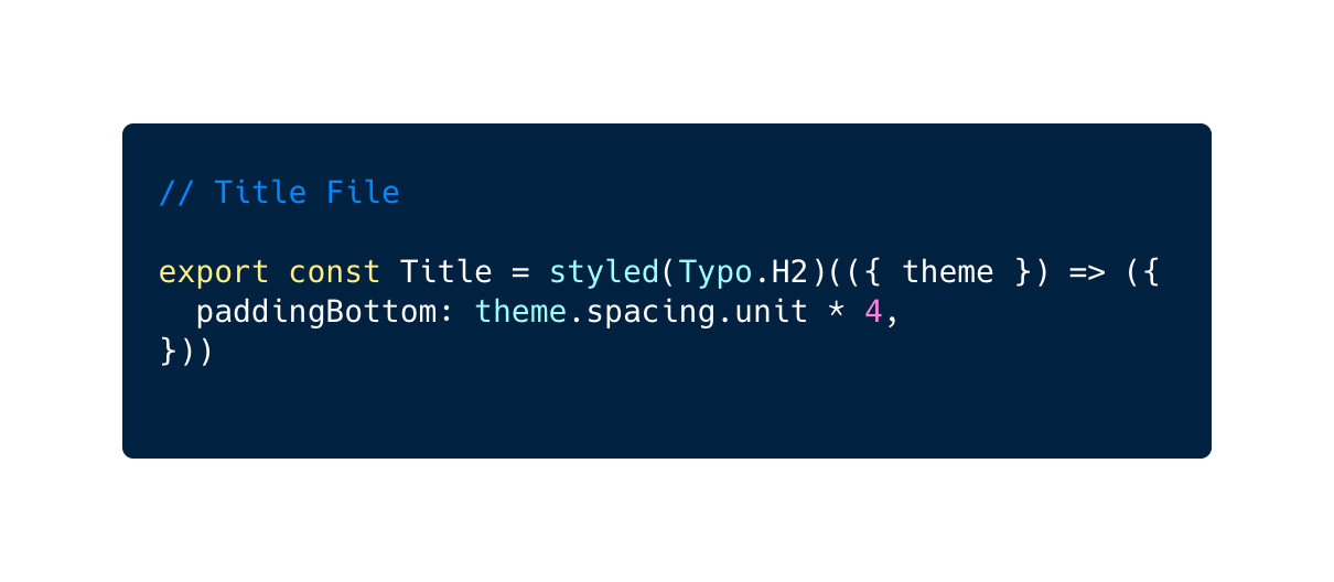
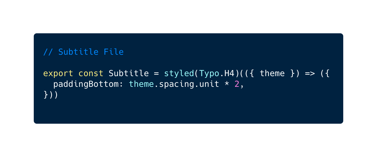
- Here, Title and Subtitle are defined in separate files and are made reusable. This is a bit absurd because in our app Typo.H4 and Typo.H2 are already reusable styled components, but bear with me because this can happen with any kind of component.
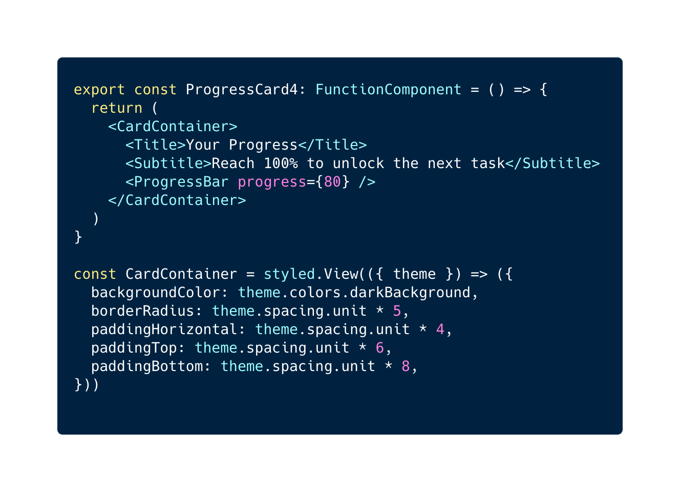
- The main problem here is that Title and Subtitle should not implement a space around themselves (be it a padding or a margin) because it is not their responsibility. If they are reused in another place, it would most likely be happenstance if the space they implemented fit where they were going. Moreover, if we were to do that, it would introduce a coupling between the spaces of this new place with the first one that is completely meaningless.
- Moreover, paddings are misused here. Instead, margins would be more correct. This is because margins should help a component place itself, and paddings should help a container place its contents.
All of this may seem very obvious, but we are just getting started ?
Let's forget about making Title and Subtitle reusable for now. Let's also replace the paddings with margins.
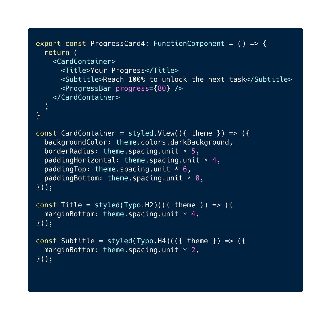
What we have done here is using styled components to add a layer of style on already reusable components H2 and H4. We'll call those components overlays.
It might look like naming the styled components achieves a really good thing: in the JSX, it is very clear what these components are: a title and a subtitle. However, note that this is only the case because the example here involves dumb components. Business components would already have an intelligible name, and since components like text have no business logic, it is not very important to identify their purpose instantly in the JSX.
Now then, the question we should ask ourselves is why the H2 and the H4 get treated differently than the ProgressBar. If we had decided to use marginTop on an overlay of ProgressBar and H4, or both a marginTop and a marginBottom on H4, we could have achieved the same result. This seems like a totally arbitrary choice, and would be hard to standardise in more complex cases.
One more thing bugs me about this. The spaces are completely invisible in the JSX. I have to check the styled declarations at the end of the file in order to see where there are spaces and where there are none.
To me the root cause of this is that Title and Subtitle have too many responsibilities. Even if they are not reusable, they simply should not have to place themselves relative to sibling components. That should be their parent's job. That is why i believe that margins should never be used, as they suggest a component places itself relative to its parent or siblings.
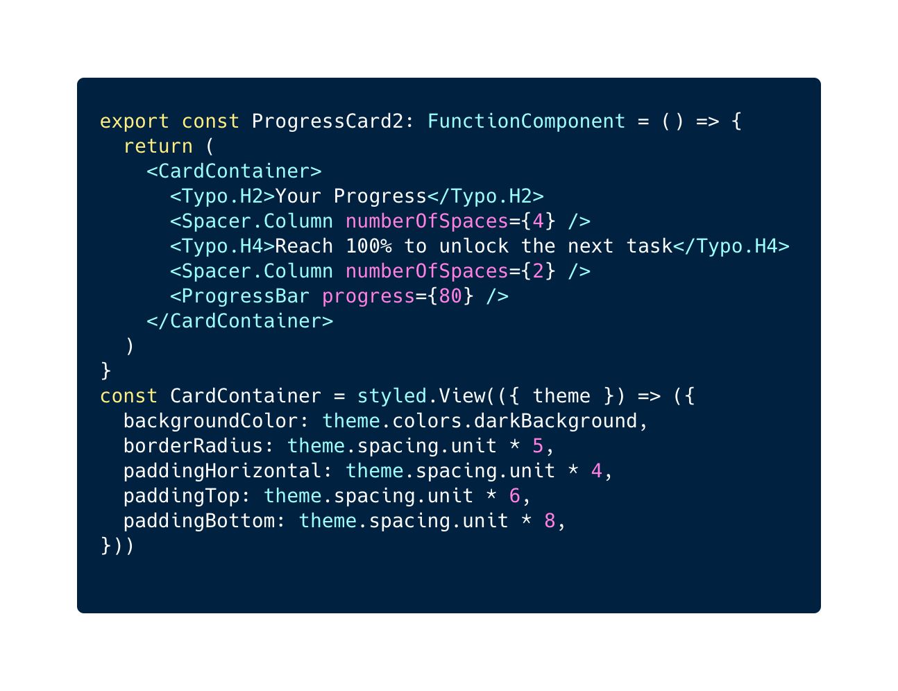
We might try giving the responsibility of placing those components over to Containers like so:
This has the added benefit of eliminating margins.
However we still retain the arbitrary nature of which components are wrapped in a container and which are not.
We also introduce a new issue: nesting components at different nesting depths in the JSX makes it harder to read. For instance, if we assume CardContainer is of depth 0 in the above JSX, H2, and H4 would be of depth 2, whereas progressBar is at depth 1. Conceptually, it makes much more sense that those 3 elements be at the same depth, as it makes the layout of the ProgressCard component readable at a glance: all three children of CardContainer are in a column.
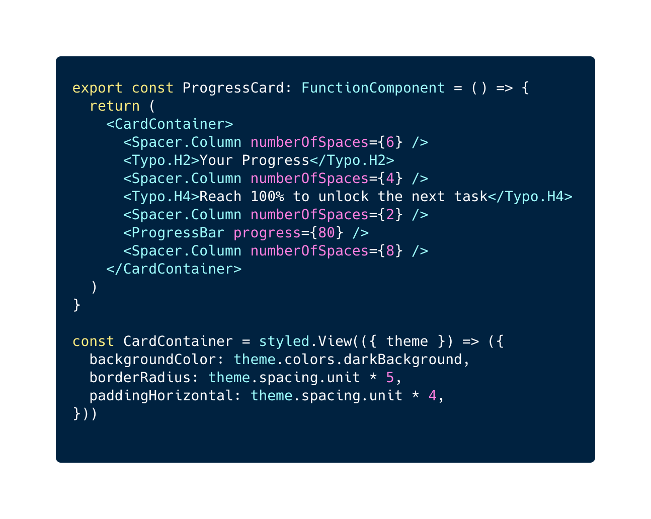
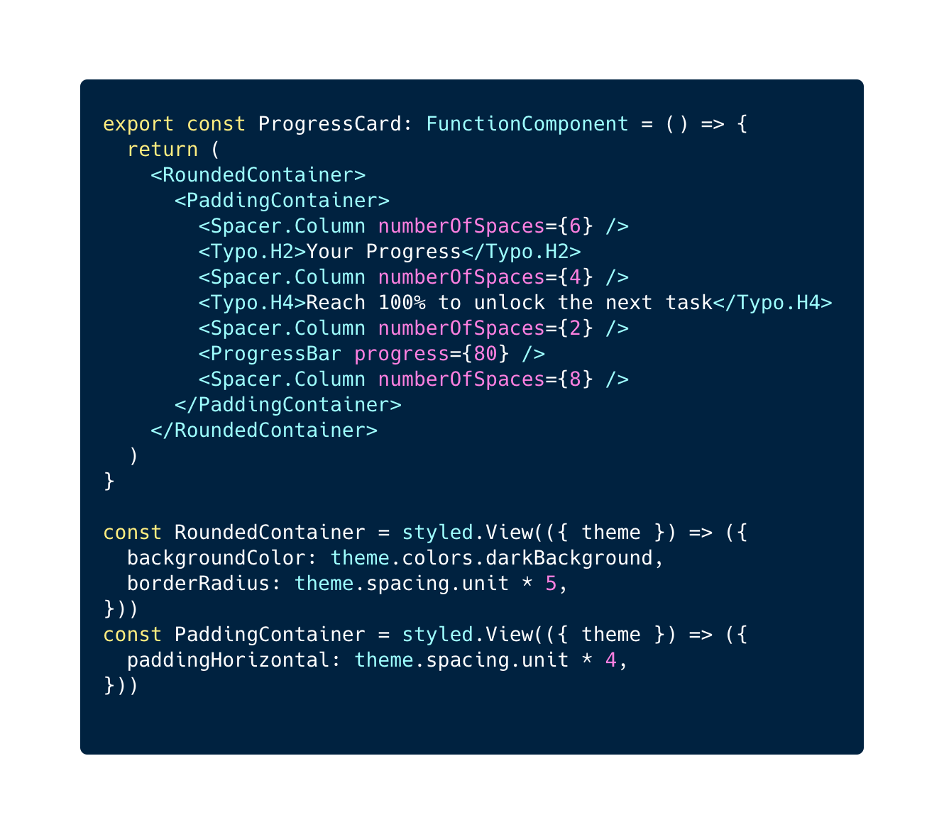
Here is what I found to solve the issues above: introducing a component whose sole responsibility is to be empty space.
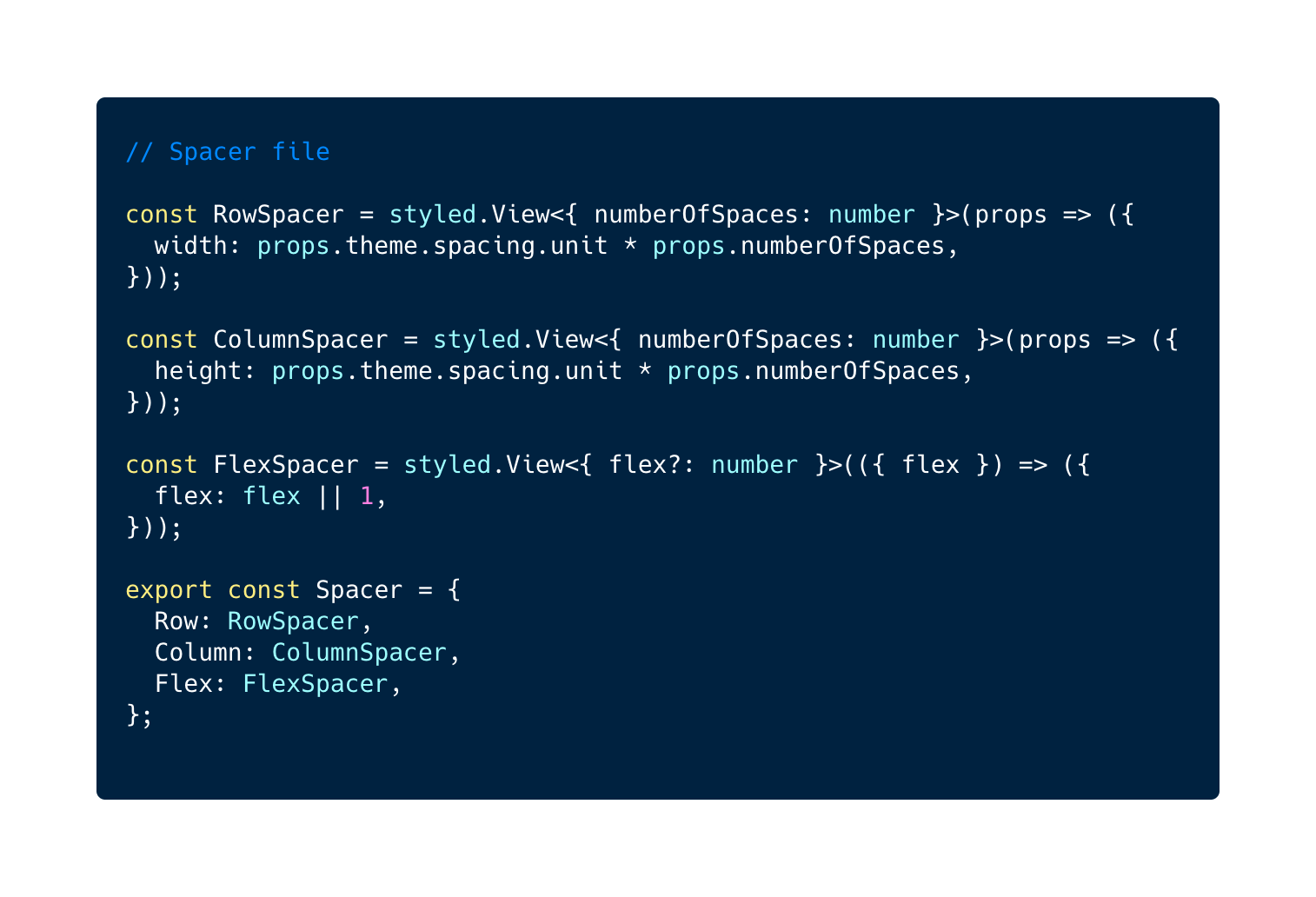
Here's what the implementation of ProgressBar now looks like:
As you can see, there are no more arbitrary choices when it comes to where the spaces are, and it is very visible where the spaces are.
In order to fully take advantage of that readability, we've even chosen not to use paddings in the main flexDirection:
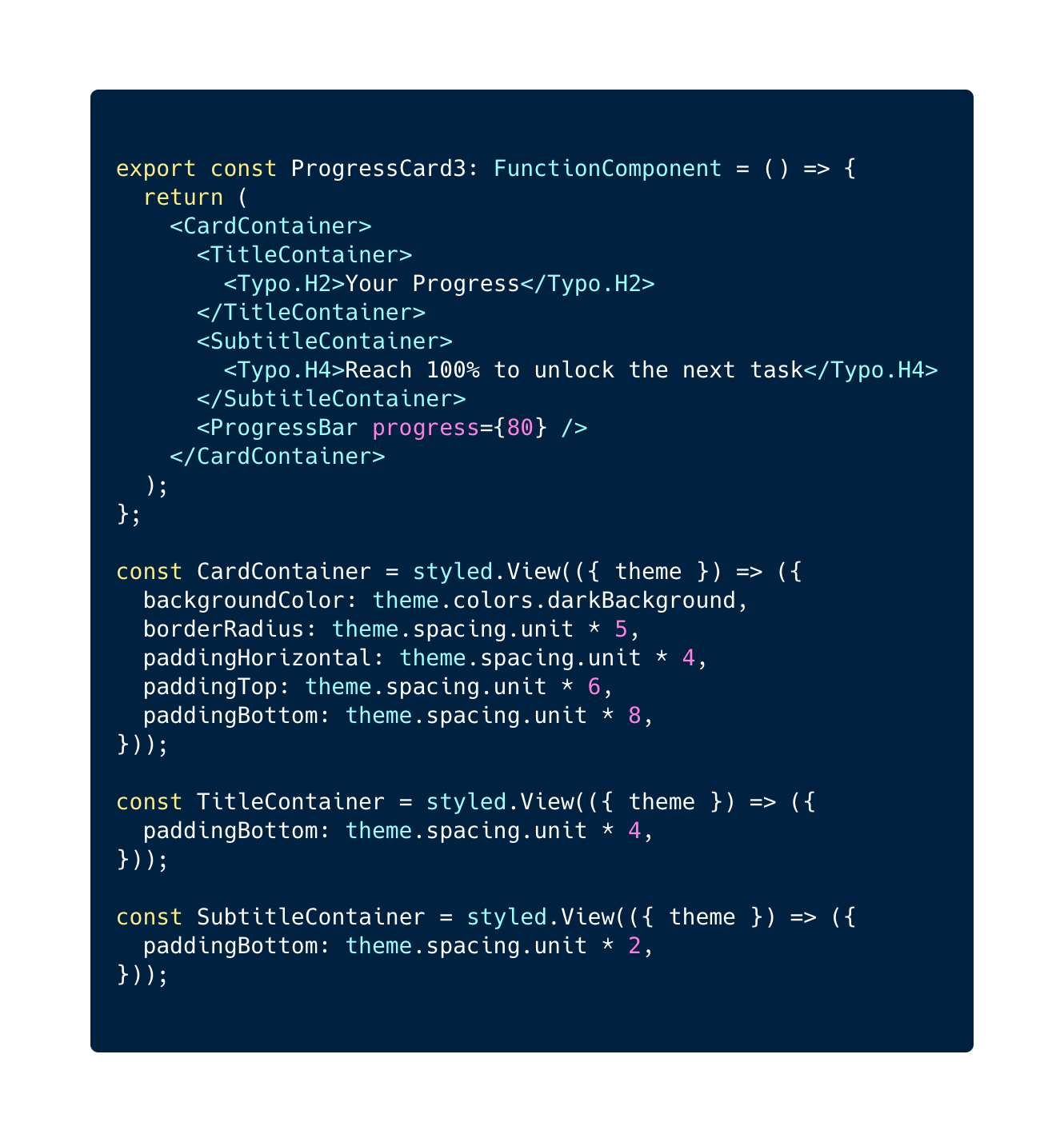
I probably would not do it in such a simple case, but we've also started separating the responsibilities of containers, so that their role can be very clear in the JSX:
In my opinion, this sort of implementation allows the clearest developing experience. It harnesses the power of styled components to give a custom name to every component in the JSX. This might look like overkill, but on more complicated components I've found that it's a timesaver to be able to fully understand where there is empty space just by looking at the JSX. Incidentally, if you are worried about producing a too large JSX, you might just need to divide it in simple blocks over multiple files.
This article is opinionated and exposes the thought process behind creating a standard. It is meant to help you come to your own standard, or even agree with mine. I hope you found it helpful!


Le BAM Innovation Lab, pour rester à la pointe des dernières innovations tech et produit !


